Wednesday, May 2, 2012

Jurassic Park Poster - in TEXT ONLY

I did this for an assignment, but I was so proud of how it turned out that I had to share it on here.  It's completely done in text.  I used only Illustrator to make it, recreating the Jurassic Park poster.  I adored the movie when it came out, being a paleo-fanatic.  It took a while, but I achieved it!  Lots of the pen tool, clipping masks, and text tool.

Welcome to My Wall

I wanted a different header for my Facebook page, now that they're doing the different appearance on the timeline appearance, so I was playing with the texture library I've started, and I came up with this.  I don't often play with textures from cgtextures.com, but I decided to give it a shot.  I like how it turned out!  All done in photoshop.

Chevelle

I took a cell phone picture of a classic Chevelle a while back, saying it's the care I'd get one day.  Well I love the shape it has so much that I outlined it in Illustrator and then outlined some accents it had, like glares and shadows, then put them on top of the car.  The shadow is another layer of outlines as well.  It took a while, but eventually it turned into this! All in Illustrator.

Birds

The poster for Jurassic Park, another of my posts, was so inspirational that when I came across a bird photo I had, I had another idea.  I outlined the bird in Illustrator and used it to do a clipping mask around a paragraph of space-free birds of prey.  I then did the words, following them along the belly of the bird.  All in all, I like it!

Bear Close-up

At the Omaha Zoo there was a bear on top of a tree.  I loved it, but the sun was so very bright that it washed out the picture, so I edited it, and framed it in Photoshop to show the awesome photo off.  I'm very proud of this picture.

Rainbow Fountain

I took a picture of a water fountain at night.  The fountain turned different colors, and that gave me an idea.  You know those iconic posters of different colored faces?  Well, same idea.  It's simple, but it was a test of Levels and Hues.  It's done all in Photoshop.

Unicorn

I like black and white logos, and I love unicorns and dragons, so...I decided to do a unicorn!  Why not?  It's mostly based on freehand pen tool, no references, and strategic arrangement with black fill and white outline.  All made in Illustrator.

Bunny Shadows

To be honest, I was just playing around, as I often do, in Illustrator with the Pen tool.  Bunnies are just fun, and I wanted to try and do a shadow type logo ...thing.  So, this is what I came up with! 

Howling Vectors

I was playing with outlines, and decided to add a bit more to an outline of my dog making a growling face.  She will keep a wrinkled nose if I say "stay" and form her face, and so I outlined it in Illustrator, then played blindly from there.  Anyway, it was done in Illustrator.

Alien Cyborg

I often just start drawing odd things, and so when I started thinking about robots, I started drawing this guy and got to about the neck, but stopped as it became more organic.  After I started it, I liked it enough to keep drawing a couple days later.  This is what I came up with, an alien cyborg...thing.  I'd like to make it over in Illustrator eventually.  Only used a mechanical pencil, printer paper, and a slightly terribly cell phone camera. 

Elk in Arizona

So there I was, in Arizona, and what do I see? An elk!  In the desert, no less.  I couldn't believe it, but they're common around Sedona, Phoenix, and on your way up to the Grand Canyon.  I took the picture and desaturated everything but the elk, then played with the levels until it created the look I wanted.  It was created completely in Photoshop.

Monday, April 30, 2012

Joseph Blake Bice

I was looking back on some old pictures of me, and recollected on some of my senior photos.  One I remember was a photo that was desaturated with a single color in it.  I liked the idea so much I took a picture of my friend from the military and decided to play with the colors.  This was the result.  I used Photoshop and blending layers, along with alpha channels.  I think, though, that he was awfully upset that I was going home and leaving him with crazy people.  Friends never leave, though! Not really, the communication distance just gets further.

Tuesday, April 10, 2012

Storm's Coming

So I was playing around with that space scene from the comets and thinking about Star Trek (yes, complete geek moment) and warp speed stars LOL so I played around with radial blur, then thought it didn't have enough, so I did another layer and made it larger and rotated it.  Well after I did this once more, I realized...it looked like rain falling.  So, being the nifty thinker I am (sometimes) I went and found a city scene (as my photograph of the Renaissance Center I took like the one above was apparently missing, and possibly deleted due to a computer crash) and played with it.  I wanted the sky to look dark and gloomy for the most part, but with the tail end of the nice bright scene leaving as the shadows creep in on the towering skyscrapers!  (Queue dramatic music here!)  So through shadows, many color layers, and my nifty rain layer being blended using blending options, I now have a beautiful rain scene in the city!  I was challenged, though, to try and make the rain into a meteor shower!  I might have to try that or maybe make it into some creepy fiery rain or something wild like that.  Anyway, the closer version is below.


Tribal Phoenix

This is one of the two swirl animals I made.  I drew this using a tablet in Illustrator and the 6D brushes.  There was no guide for it.  I just randomly laid down the lines and decided what looked good.  I came up with this!  I then took it into Photoshop and colored it, as you can see.  That was blended and brushed there.  I really, really loved how this turned out.

Trinket Necklace

I had seen a multi-chain necklace before in a gift shop, but I decided that I could make it better!  So, though it's still something I could add to, this is it!  I collected pendants for it over the course of a month or so with different sales and stores.  I stuck to things that had meaning to me.  The few times I wore it so far, there has been a lot of positive feedback, with a lot of suggestions for making others, perhaps even selling them.  It was a great adventure and fun getting back into my jewelry making, as I used to do silversmithing years ago.  Anyway, this used the pendants, chain, jump rings, and 4 different types of pliers, held with a lobster clasp.

Peaceful Dreams

So Princess was sleeping on my leg while I was on Photoshop and I had an idea.  I'd never used my tablet to sketch before.  So, since 1am was hardly late enough to go to sleep, I started sketching her.  It was fun!  I liked how it turned out.  This was completely Photoshopped, no sketching or guides, just completely freehand on the Wacom Tablet.

Tribal Jackal

One of two designs I made in Illustrator with a fixation on swirls.  I wanted something a bit abstract with swirl patterns, and, as is obvious from my choice in pet, I love long ears and a bit more jackal appearance to dogs, so I decided to play with that idea.  After designing it in Illustrator, I took it to Photoshop to color it, and voila!  This was the result.

Peel Back Reality

This started as an assignment, but I took it and played with it later, adding the comets (another experiment I did) and fixed a bit of a flaw on the original.  It's made using Photoshop and Illustrator.  The page turn is an Illustrator piece with a gradient to give depth.  This was made to be my background wallpaper for a period of time. Everything is from scratctch except the window, which is stock photography.

Princess Dress

Yes, I'm slightly odd, but not as odd as my dog.  Not only is she bouncy as can be and loves the camera, she also LOVES wearing clothes.  I'm not even kidding!  She helps put on clothes, turning onto her back to do the velcro on the tummy.  I made this as an experiment with my new adventures with machine sewing. Using brocade, satin, and tulle, with bias tape, I sewed it together using a pattern I made myself based on a couple things I'd bought before for her.  It was challenging though.

Detroit Tigers Paw

I went to my very first Opening Day, so I just HAD to make something fun for it!  I made a paw, using a foam blue paw as a base for it.  I then took orange glitter paper used for scrapbooking and cut it out in the shape I wanted, with a matching, slightly smaller version cut out of tiger-print felt, layered them, and hot glued them to the blue foam paw.  The letters, which took me a while to decide on, actually, are blue foam letters stuck onto white glitter paper (again for scrapbooking) and cut out in a boarder around the black foam lettering.  What you can't see, is there's a ribbon attached so it can latch onto the bag and hang for transporting in a more convenient way.  The photographer from Detroit News (newspaper) loved the paws (my mom made one as well) so much he took the biggest picture for the spread (one of the whole stadium) with us in the center.  It was an amazing shot, too.

Detroit Tigers Drawstring Bag

I made this from scratch, save for the stitching on the patch and such.  I made the bag from an orange color jean material and a navy blue cotton cord.  I added a Detroit Tigers patch (courtesy of Ebay, though you'd think you'd be able to find a Tigers patch in the Detroit area, right?) and words that say "Go get 'em Tigers!!" with a baseball and inside, my name.  I've also added a pocket in the inside for tickets.  The drawstrings go through eyelets I put in.  Each strap ended up having to have like 2 yards each of the cord, more than I'd expected.  The patches and letters are ironed on, and the bag is sewn together by both hand and machine, depending on the part.  I took it with me to Lakeland for Spring Training, which was great, but it's now a very appreciated part of my game outfit for the baseball games.  I had hoped for autographs, but since the Tigers are stingy, the Tiger D will just have to stand on its own!

Good Year Blimp - Photo Editing

So I went to Opening Day at Comerica Park on April 5, 2012.  Not only did I catch a cold there, but I also caught a few interesting pictures.  Seeing as how the sun decided to grace us with its presence finally when the game began, it didn't exactly give a good set up for aerial photos.  When the Good Year blimp went by, I couldn't resist the chance for a picture (original seen on the left), but unfortunately it turned out washed out due to all the sun.  Since I'm still learning photography, I decided to utilize my Photoshop skills to fix it instead.  With a bit of advice, I finally cleared it up a good bit using levels and a couple of noise filters to remove noise.  I'm actually very happy with how it turned out.  Maybe one day I'll be able to make it even more sharp without degrading it.  Maybe!

Eyeball Comet

Simply because someone, who shall remain nameless, mentioned that disembodied eyeballs are creepy, combined with my venture into making a comet, I had to make an eyeball comet!  Makes sense, right?  Basically, this is done in Photoshop.  It's a rare occurrence for me to stick to one Adobe program, but I did it, finally.  The stars are like 3 layers and the comet is a mix of noise, glow, paint, and of course an eyeball blended into the head of a comet.  It was fun to make, and even more fun getting a laugh out of it!

Jewelry Gift Box Logo Design

I do a lot of different manual crafts, like jewelry and sewing, and with my recent venture into jewelry, I was looking at my trusty source of Rio Grande, which I've trusted for my metal work for years.  When looking into boxes, I found that you could customize the box for a cost with a personalized logo in foil stamping, making a custom die and everything.  The directions suggest using thick lines, not thin ones, as they show up better, and said it has to be black and white only, no gradients or color.  Since this was the case, I decided to use the font I'd chosen for my logo and wrote out the words in that font, then took the logo and simplified it, taking out the letters and making the face a solid color.  Artwork & Jewelry by Stephanie Beauvais was added on the bottom in the end, and I seriously debated whether or not to include a email, but when tested, it turned out too thin, making it doubtful that it'd turn out well on the product.  I placed the image on a stock photo of their box found on their site to try and see what it'd look like, mimicking the blue foil they show in the example with my logo.

Tuesday, February 21, 2012

Logo for My Mom's Art

So my mom does a lot of crafts and hand-jam type of art.  She's the one that inspired me to start with art when I was a kid, so I thought I'd give a logo for her a shot.  She wanted it to incorporate the things she does, which are photography and sewing (In fact she just taught me to use a sewing machine!  I don't have to break my fingers hand sewing anymore!).  I had to do all the elements separately, which was a bit of a pain.  The G flows into the thread of the spool that goes through the needle that sits in front of the D.  The Made with Love patch is like a tag I saw at JoAnn Fabrics that goes into clothes that are hand made.  My mom, also, is a phenomenal photographer.  She's better than a lot of the wedding photographers I've seen at weddings :)  Anyway, I thought for a starting point, these turned out fantastic!  Enjoy.

Needle and Thread

The logo for my mom's artwork had to reflect her art, which is mostly crafts, so the most important element had to be a needle and thread.  The spool of thread was the most difficult part, by far!  Anyway, it's purely from Illustrator.  The presentation of the frame and gradient were done in Photoshop, though.  I was VERY happy with how this one turned out.  In the logo, however, the thread looks like it's going through the actual needle. 

Made with Love Tag

This was a test of whether I could do pulled material on Photoshop using just paintbrush, smudge, burn, and dodge.  I think it came out alright, but not completely sure.  It's something I'm new to, but it's a good attempt!  I'll have to keep trying.  The tag itself was made in Illustrator, another element I used in the logo.  It is meant to look like a tag you sew into hand made clothes.  The canvas look was done in Photoshop. The rest of the logo was done in Illustrator.

Vector Camera

I had to make many elements for a logo I was planning, and they took so much time to figure out in themselves that they ended up being designs in themselves.  This is the camera, as you can see.  It's made in Illustrator, using shapes, mostly, and pathfinder.  The only time I used the pen tool was to make the uneven black on the main part of the camera.  It was finished with a couple faint gradients, then took it to Photoshop to make a shadow and light from the top left just to present it.  In the logo, it won't have the shadow or lighting.

Tuesday, February 14, 2012

Broken Down Butterfly Chair: Time to Remodel

It's not enough for me to just have a ratty old chair.  No, I have to do something with it.  Whenever something is plain, even if I love it at first, I'll eventually do something to revive it.  I've had this chair for YEARS!  I believe it was a birthday or Christmas gift at one time, but over the years the black canvas type fabric has dulled, and eventually ripped on one of the sides.  Something I learned from my mom is when something like a chair looks broken or ready to throw away, it just means the fun starts.  Time to remodel it.  This fabric was left over from the two bolts I bought to make curtains to hide my storage room.  I have this crazy fascination with pink camouflage.  Not to mention, I love fluffy malibu style feathers!  Ten years ago, if you told me I'd be making a bright pink chair and loving it, I'd have thought you were nuts, but anyway, I loved this snuggle flannel (yes that's really what it's called) fabric, so soft, but not too fluffy that it doesn't breathe like the anti-pill fleece, for example.  I started with only the intention of covering it with the fabric, but as I started pinning the fabric in the odd, curved seat hanging on the metal frame, I realized something was missing.  When I went to JoAnn's after class to perhaps try and figure out what was missing, I'd practically given up, but when I went to check the areas with the boas and feathers, as I always do (as if I don't have enough feathers for my crafting) I found this pink malibu type boa.  What's more, it was buy one get one half off!  Lucky days :)  So I was in luck.  They had four left.  Since I had no idea how it was going to work yet, I grabbed all four and went home, starting to pin it on, completely having to re-pin the edges of the material, though, and cut them to be more appealing.  It was all coming together.  Perhaps super-girlie, but hey, not like that is a first with me!  This project was probably the most painful of the week.  As I hand sew everything, in the two days it took to finish this (when I start, it's hard to stop!) I must have cut my hands on every push pin in the thing!  Finally, after it was done and my clothes were covered in pink strands of fluffy feathers from sewing them together, I had a brand new chair! Not only did it revive it, but I was able to fix the torn side that made it impossible to sit in!  This was, honestly, extremely fun.  I consider all the knicks on my hands signs of hard work and totally worth it. 
The compilation was created in Adobe Photoshop, by the way.  The photos taken with the black material background were cropped, sized, and placed into a new document where the pink boarder was created by using a canvas size for the larger pink, a 20 pixel black boarder around the outside, and two smaller frames cut from a rectangle carefully.  The text was created in two layers on a pink rectangle.  The top layer of text is black with a speckled brush set to a low opacity and strategically set to erase much of the text, leaving only a speckled, faded, faint layer of the words.  Below it is a layer that was not edited much, other than a faint gaussian blur to make the edges less harsh.  All in all, I think the project as a whole was successful (Even if Princess wouldn't get out of the chair for half the photos!  I guess she approves of it, too!).  The most difficult part, though, was admittedly the corners.  They were tricky, especially with two lines of the trim, but as the picture shows, I think they worked out well.

A Safer Collar: Paracord

I started making survival bracelets shortly after getting out of the Army, where they're extremely popular.  The idea behind survival bracelets is that they are made from 550 cord, commonly known as paracord.  The Army calls it 550 cord because it can hold up to 550 lbs, which gives you a fair idea of how versatile and valuable this simple cord is!  Survival bracelets are a way to wear this necessary resource in a small, easy to contain, easy to reach manner.  If you're in danger or an emergency, you unknot the cord, which is surprisingly easy.  The knot is a fairly simple knot, and perfect for someone as OCD as I am.  This fascination began when I looked on a popular survival bracelet site, where a lot of my platoon sergeants had ordered theirs.  They guarantee that if you ever use it, you can send in your story and they'll either reweave it, or replace it!  They had ones with dog tags on it, which I thought would be great since I can't seem to part with my dog tags for very long yet, but they wanted so much!  What's more, I was looking at ones they'd made into collars, and the price was twice, maybe three times as much as the bracelets!  Well I thought that was just ridiculous, and I sure wasn't paying tons of money for a collar someone else made when I was good at figuring things out for myself.  I'm stubborn that way.  So I went on youtube, the holy grail for all those that like to self-teach, and found out that the knot is called a cobra knot, or cobra stitch as I sometimes incorrectly call it.  That's fantastic! I was ready to go, but the guy in the video wasn't done.  What could the other half of the video be, exactly?  It was something called a KING cobra knot, which was basically going over it again with the knot a second time.  I thought to myself, well that looks even better!  So I took one of the cheaply made copies I'd bought at a store called Five Below, that had fallen apart in probably about a week, and took it all the way apart.  Wow, easier than I thought.  I then started practicing.  In the meantime, I went onto ebay (of course) after exhausting my search for PINK paracord at every place I could think of, including the ANG base, and coming up with only black, grey, and brown.  Ebay, however, was a gold mine.  Cheap prices and more colors than I could choose from.  When they came in, I made probably three bracelets before my fingers were sore and starting to make blisters, so I'd obviously found something I liked.  As I looked at them, though, then to my dog's old, worn, but still cute collar, I could feel the lightbulb pop on in my head.  Click.  Why would I pay all that money, when I could make my own?  Wasn't that the question that started me searching in the first place?  So, with the hot pink I'd bought tons of, I made my first collar, but firstly, the single knot wasn't big enough, to me, so I tried the King Cobra knot.  Well, there were several things wrong with the first collar I made, though most weren't noticeable except to me.  There was too small of a clasp on it, that didn't stay together if she were to yank on the leash.  Granted, it's good that it can release if she tugs hard on it, in case she's in danger or stuck, but not so good if it comes apart with a little soft tug!  Second, I did each layer of knots separate.  The ends have to be burned, so that means there were four pieces of the 550 cord, which is a complete waste!  There were a few other minor, OCD things that I wanted to correct, but the two previously mentioned were definitely the main problems.  So, I wanted to remake it.  I made it out of one solid set of cords, two colors burned at the ends and stuck together, and then fixed the minor problem of a crooked D ring (which by the way is the hardest part about making the collar, getting the D ring into the knotted weave), finally adding a nice latch instead of the cheap one made for the single knot bracelets.  I'm much happier with this one, and plan on doing a larger one for the other dog (which is what the white cord has been started for pictured in the center).  I've received several compliments already on it, especially now that it doesn't have a bad latch!  Princess decided she wanted to model it instead of just laying it on the black background.  The idea of making a collar out of this is for two reasons.  One, it just looks great, and is fun to make, but secondly, Princess goes hiking with me, so if I'm in danger or in an emergency situation, her collar can act as a backup for any paracord I may have, or possibly had forgotten at home.  It ensures I'll always have that lifeline (literally) there for whatever happens.  These are fantastic for the outdoors, active type of dogs, and they're unique!

Druid Staff: Fixing Mother Nature's Blunder Part TWO

Since Mother Nature couldn't stop at ruining my boots of my costume, the staff took a beating as well.  Everything on the staff, which I have actually been working on here and there over the last TEN years (taking it apart, remaking it, etc), had to be redone.  The bags were additions I added for this, and the tail is the first I'd purchased two years ago when I went with my mom on a visit during a holiday while I was in the Army.  The bags are hand sewn (which as I've already said, isn't possible for me without covering my hands in little cuts from push pins!) and made of natural rabbit pelts, using the uneven edges to make a wild, primitive look.  The one thing that's not primitive on them? The intense magnets I used to keep them closed.  They are laced with a thick leather cord and tightly attached to the mid section of the staff itself.  From there, the feathers (more to be added later, actually) are added, and finally enough slack is kept in the cord to be able to slip the tail's leather ring through and snap it on.  About one foot below the bags is a ring of either bear fur (I forget) I had left in the scraps (I still have a LOT, actually).  Finally, a tuft from a raccoon tail is added in a bare spot around the mid section between the tail and one of the two bags by sewing through the pelt section and tying it onto the cord itself.  There is a lot more I want to add to the staff, but this is a start.  The bags are fun to make, and rabbit pelts are very easy to sew through, though sometimes too easy, causing them to rip if you're not careful!  Maybe later, after a lot of other things are completed, I'll have a chance to really get into adding all the crazy stuff I want to to the staff.  I have tons of feathers and a couple bear claws my uncle gave me that I'd like to add to it as well, so, as it will always be, it's a work in progress.  Something like this ends up evolving as I change.  Installment two in the Mother Nature Remake!

Druid Boots: Fixing Mother Nature's Blunder

My druid costume has taken a lot of work, burns, cuts, and blisters to make, but during the renaissance festival last fall, my boots I'd made took a good beating.  They were full of mud and pieces had torn off because of that.  This week, being a more hands-on art week, I decided to fix them.  These were originally a pair of leather hand made sandals, but my dear dog got ahold of them and had her way one day when she was upset with me.  Great!  So there was nothing for me to wear on my feet other than a pair of running shoes.  That wasn't going to work, obviously, so I took the scraps I had from when I made the cloak, and pieced together this.  I made the skeleton of it out of a leather-esque material and leather scraps.  The pieces were then both stitched as well as hot glued (gives it a bit more of a secure fit), but even all that wasn't a match for Mother Nature.  So I had to pull the pieces off and match scraps to the boot.  There are three straps that go around and then the shoe part, all lacing up with a leather cord.  I added a charm on the bottom that is a sort of shield with chains hanging, giving it a more tribal appearance.  In the winter, there are black warm socks that go under the boots, hidden for the most part except at the toes, as there are openings there.  The idea was inspired, actually, by muck-lucks you see on the Inuit in like Canada and Alaska.  Their art was pretty plentiful in Vancouver, BC.  I think the mix of colors in this version is very effective.  I have another pair of boots I want to attempt something like this with, but thicker and more winter-friendly!  Anyway, the furs are fox, beaver, bear, rabbit, and skunk, recycled from scraps that would otherwise be thrown away. Just the first of many remake projects this week. Busy, busy!  (...And I have the cuts on my hands to prove it!  It looks like a feral cat got ahold of me!)

Monday, February 6, 2012

Eye of the Beholder

I'm actually completely unsure what spawned me to make this, but I guess I wondered if I could make an eyeball from scratch.  It's not in 3DS Max, only Photoshop and Illustrator.  I used blending modes to help mix the layers, filters to create the sphere look of the knife in the eye, smudging to make the burst in the iris, a low opacity paintbrush to do the veins, and finally the most difficult part was the lighting glare that mimics the clear part overlaying the eyeball  (not the two white dots but the sheen from the left).  The knife has blood on it, which are actually from a paintbrush, and a spherize filter to make it bubble like it's on a curve reflection.  Anyway, this is my first attempt at an eye, but I think it was fairly successful.

Cousin's Logo Part 2

I was working on my cousin's logo, and I started thinking of more ideas!  I took the butterfly and duplicated/rotated it.  I took the two capital letters and faded them in the back after layering them in illustrator.  The name was realigned to fit better, as well.  I like the look of a square as opposed to the rectangle.  It seems clean and brighter than the other one.

Cousin's Logo Part 1

My cousin is a brilliant artist (it runs in the blood, you know?), and between crafts and photography, she has a lot going for her (Not to mention those three adorable kids!), but she has no logo!  Though I can't seem to find the paper with her company names, I started playing around anyway.  I started with this with the letter K.  I took it in Blackadder and, since I didn't like how messy it looked but really liked the curled ends and top, used the pen tool to outline it and make it more crisp.  I used the handles to clean it up more, and finally repeated it with the L.  I then took four of the K's and created the butterfly background.  I took the pieces and pasted them in Photoshop to do the colors.  There are actually two layers to the letters, making it blend with the butterfly, though subtly.  Finally, there's a gradient with color on the butterfly.

Eagle Logo (Plus a bit of Color)

So I was playing on Illustrator (What's new?) and came up with this.  It was originally just black and white, but the eye seemed so ...lacking.  So I took it from Illustrator's Pen tool to Photoshop and the brilliance of color.  Through paintbrush, smudge, and layer blending, the eye color came through.  I thought about doing the rest of it, but sometimes simple is better.  All the attempts seemed insufficient.  All in all, I think it gives it dimension with the color.

Tuesday, January 31, 2012

Neko - An Experiment
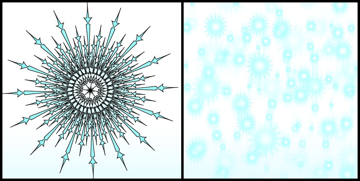
I tend to rely on the pen tool a lot for my graphics, because I'm comfortable with it and tend to excel with it.  With that in mind, I once had an instructor at VFS that made her characters (which were actually very cute and ...kinda awesome!) by using only shapes and pathfinder in Illustrator.  With that in mind, I thought I'd give it a shot!  I'm not sure what it is, but it was made, VERY carefully, using only shapes and pathfinder, and a sketch I had as a guide.  The hardest parts were the whiskers and ears, though, because of all the dips and curves.  So, for the most part, Mission Accomplished.  Next step is to try making one with a faint gradient for depth.  We'll see.

Snowflakes

I do love making snowflakes.  I remember cutting them out when I was a kid, but never quite getting them to look nice (usually I ended up cutting the side that held it together! Ooops), so maybe this is my revenge for all the misshapen paper snowflakes of my childhood!  Seriously, though, I wanted to show how taking the Illustrator creation of the snowflake and applying it in Photoshop could create a snow storm, so to speak.  You take one, resize and move it repeatedly until you fill the screen.  You can then take those, merge them, and rotate/resize those as well.  You take the other layers of snowflakes, however, and lower the opacity so it gives it depth, also erasing any overlapping ones that look wrong.  Finally, you take the layers, merge them into a flat layer, and duplicate it.  Take the bottom one of the two and apply a motion blur and play with the settings until you get your desired appearance.  Don't forget to change the degrees!  Anyway, I liked how it came out and thought I'd make it into a board where you can see the individual snowflake and how it can be made into a snow fall.  Mind you, the outlines come of before you make the snow.

Demon Wolf

This isn't terribly unusual for me.  I will sit idly and just play with Illustrator like a drawing pad.  This is just made using the pen tool.  There was no guide like a sketch or photo or anything to influence it, just my weird imagination at work.  Purely Illustrator's pen tool with a gradient background.

Winter

A friend of mine likes trees and winter, and I was just playing around recently trying to make trees with Illustrator (which, for me, is harder than I thought it would be!).  My biggest obstacle was that I always wanted to make them so symmetrical, or the branches didn't have enough twigs sprouting from it.  Finally, though, I made one that I liked, referencing a dead tree, though only slightly, since it now looks nothing like the photo I was looking at, simply because trying to make all the small little offshoots starts to make it look even more fake!  Less is more sometimes.  I had thought of making a cemetery scene, all spooky, but with the snow fall, I decided to make it winter (especially since that's what she was talking about in the first place!).  Besides, I love making snowflakes!  So I did the outlines in Illustrator, as well as the snowflakes and moon, and the coloring on the vertical rectangle and tree were put in using Photoshop (since I didn't originally connect the lines, making it appear more like I had inked it with a paintbrush).  A note, as well, on the lines, is that I love using India ink and those Japanese paintbrushes.  I originally played around with them in my first year of college, where I outlined these sort of abstract collages, and the neat part is it depends on how you hold the brush to determine the thickness of the lines.  I thought thick lines on the tree made it look painted, with that same method.  Anyway, it's sort of a bookmark.  I think it was successful, personally.

Tuesday, January 24, 2012

Toyota Concept Car

Toyota had a great concept car that could be camouflaged.  No kidding.  On the side, there was artwork animating across it.  The applications for this for personalization for owners and advertising for companies is limitless!

The composition is made using a photograph I took at the auto show, and outlining it in Illustrator due to the more accurate pen tool.  After I outline the parts I want to copy, I take the outline to the photograph in Photoshop and copy/paste that section of the photo, getting rid of all the excess.  The edges are blurred slightly in order to blend it to a black background, and the Toyota symbol is applied instead of words.  Simplicity.  The aurora in the background is done using strategically placed colors caught from the tiny logo on the car and the lights, then a motion blur applied at a lower strength.  Finally, a gradient mask is applied to it to blend it into the picture.

Falcon Motorsports = Amazing

Falcon Motorsports had one entry for the Auto Show, and that's really all they needed, because this one was absolutely impressive.  With a price tag of $125k, it was worth the fifteen pictures I sat there and took to get some nice, useable pictures.

The composition is made using a photograph I took at the auto show, though one of many, and outlining it in Illustrator due to the more accurate pen tool.  After I outline the parts I want to copy, I take the outline to the photograph in Photoshop and copy/paste that section of the photo, getting rid of all the excess.  The colored background was made with crosshatched lines blended with colors in several layers using blending modes.  The text was made in Photoshop, a blended tri-color gradient over it, and a copy of the text was applied behind it with a strong motion blur in order to create the movement on each letter.  The windshield has reflections of light as well as the reflections of the background's colors using many layers of blending modes and masks.

Lexus Concept Car

The Lexus area at the Auto Show had a great couple of cars showing off this year.  One was the LF-LC Hybrid.  It's a concept car that is made from a single block instead of being pieced together.  Strange right?

Anyway, this was made using two different pictures I took. The composition is made by outlining them in Illustrator due to the more accurate pen tool.  After I outline the parts I want to copy, I take the outline to the photographs in Photoshop and copy/paste that sections of the photo, getting rid of all the excess.  After that, a mask is applied to each layer and blending is accomplished using this noninvasive method, ensuring if a mistake is made it can be undone.  From there, the text is made in Photoshop and a gradient is applied.  The colors for the text are selected using the eyedropper tool and picking them from the car itself.

What Does The Future Hold?

At the 2012 Detroit Auto Show, the auto companies bring out some pretty crazy concepts.  The EN-V is a people-mover like the Segway, but in a shell and room enough for two people.  Add a couple rockets, and it would look like something from The Jetsons!

The composition is made using a photograph I took at the auto show, and outlining it in Illustrator due to the more accurate pen tool.  After I outline the parts I want to copy, I take the outline to the photograph in Photoshop and copy/paste that section of the photo, getting rid of all the excess.  The colors in the text, done in Photoshop, were picked out of the EN-V by the eyedropper to make it accurate.  The reflection in the windshield is burned to darken it, as well as desaturated to get rid of pesky red reflections that were on it.  The figures in the reflection were carefully smudged to be unrecognizable.  It seems really weird, but kind of neat!

Monday, January 16, 2012

Decorative Cross

This is something that started, as an idea, back when my mother was trying to put a poem on a picture she'd found in memory of my grandmother that recently passed.  It had this terribly pixelated cross on it, but it was in pink.  My grandmother's favorite color was pink.  As such, I decided to take my little decorative lines I like to do and make a cross out of it, perhaps in her memory, in my own way.  I started, of course, in Illustrator with many, many lines and many, many duplicate rotation actions.  All in all, I think it turned out well.  After that, I took it to Photoshop, where I made two layers of the cross, the center lightly taken out of one, and the other far more taken out (using masks).  This gave me a great way to make the center seem more bright than it did before.  With a light fading mask on the center of the top cross, the bottom one, when made bright pink in Hue/Saturation, seems to be on the verge of bursting with light in the center and toning down into the darker pink/purplish colors.

Tribal Horse

I wasn't quite sure what to call this, but I was originally making a horse logo, and decided to play a bit with it.  I manually gave it a shadow that was long, sort of like those movies where the tall, menacing shadow gets smaller as the cute, innocent creature gets closer.  Anyway, it started in Illustrator and was taken to Photoshop to do the gradient and shadow.  I like the simplicity of pictures like this, but it's definitely not something I can often do successfully.  There's a first time for everything!  Practice makes perfect, though.

Das Boot!

Modelling has never been my strong suit, as I have self-taught Photoshop and Illustrator for 13 years, give or take, so being that 3D Modelling is new to me, generally speaking, I wanted to explore it.  Here's what I came up with.  I modeled it in 3DS Max, of course, and took it to Photoshop.  The designs are done in Illustrator.  I added in the loops on the side as though the wearer would put leather straps through them to attach the plate to the boot itself.  Later, I may add to this one.

An Experiment with Photo Editing

I love photography, as is probably obvious from my blog, but I always see these photos from professional studios that turn out so well, while my photos always end up looking a bit off, despite the good camera.  So, I decided to take a picture of me and my very red eye prone dog and see how much I could fix it.  I was very happy with how it turned out, actually!  By taking it to Photoshop and playing with levels (which I rarely use, to be honest!), blur, and a variety of other tools to create this appearance.  All in all, I think it looks a hundred times better!

Tuesday, January 10, 2012

What is the World Made of?


So I saw something flash on someone's computer while they were surfing the web, and there was something completely different, but for some reason, I thought it looked like a sphere with a wedge out of it.  It started from there.  It was done completely in Photoshop, which is unusual for me, but I originally drew it as a sphere with a wedge out of it and a darker orange from the orange sphere in the center.  From there, a suggestion was made about what if it was a world, so I did...and it looked like the Earth was a Cantaloupe.  The core, though, looked more...Avacado.  It only made sense to change the color.  From that, I created these: