Wednesday, January 27, 2016

The Adventure Park

An aerial obstacle course and zip line company called The Adventure Park is a new addiction for me. When they decided to have a design competition for shirts I jumped at the chance. The entries done well were pretty much the same plain design, so sticking to something simple just wasn't going to catch their eye at all. I would have to do something different to stand out. Well it took a while because I really did want to go with a more simple design, but I figured out something more colorful to enter. The rules for winning or even placing the contest were simple. .ai files with vector graphics. Simple enough, so this is what I did completely in Illustrator with a blue and orange color scheme, which I felt was an appropriate color palette for the outdoors without getting too plain and still retaining an effort to stand out. The trunk of the tree reads "Adventure in the Trees" although not plainly obvious, but rather subdued. No results have posted as of yet. 


Wednesday, June 18, 2014

Club Pet: On the Go! Business Card and Tri-fold

Val, my groomer for my beautiful Pyrenees service dog, has been an awesome friend and is opening a mobile pet grooming service.  Jumping at the chance to help her design her new business cards and logo, I got to know a bit more of what she likes! Come to find out, butterflies are of significant importance to her and she likes the aqua to purple gradients in some of the Papyrus designs at Whole Foods. After making the business card designed with a faux fold-over appearance, we decided an actual trifold card would be awesome too, to make a price list.  The prices and list aren't on the graphic as of yet, because the costs have not been set nor has her menu been decided, but here is the design of both the normal business card and the trifold menu-to-go! I'm so excited to do more improvements to it!
Illustrator was used to start 80% of all graphics and text, and they were compiled in Photoshop and applied finishing touches. In order to make it match the business card, I took the top layer of the business card and separated it, rotating it and applying it to the top of the trifold, then the same with the bottom, removing the layer mask on the dog paws in order to make a 2D version where the actual top will truly fold over the bottom to match the card.

Club Pet: On the Go! Logo Design

My service dog, Sadie, is a Great Pyrenees, and if anyone knows anything about a Great Pyrenees, they need a LOT of grooming.  After two years here in Texas, I finally found a groomer I adore that spends lots of time to make sure she's well groomed to be in public, especially with the high heat here during the Summer. Pyrenees tend to blow coat, and Val is the absolute only groomer I trust to pull as much of that coat as possible to minimize the shedding in public areas.  When she said she was going mobile, I was more than happy to lend a hand! Butterflies have a very special meaning to her, so I designed butterfly wings especially for her and integrated them into the dog paw design. Voila!
I used Illustrator to design the graphic itself, and placed it into Photoshop to apply effects and blending modes. We established the two colors and a decision on gradient direction early on based on, ironically, a bag made by Papyrus (a company I used to work for mind you) we found at Whole Foods. I thought they turned out great! Next mission was to make a business card.

Wednesday, April 10, 2013

Training Schedule Graphic

So I had to make a graphic for the company website that reflected schedules for classes.  They liked the idea of clocks and calendars, and they preferred to keep it realistic by manipulating stock images.  Through Photoshop and stock photography, I created a graphic that made it look like it was falling out from behind the text "block/card" or out of a cut in the webpage.  There was another version, as well, using 3DS Max, but this is the one that was decided upon.

The Million Dollar Challenge

This is one of many of the front title pages for The Million Dollar Challenge game made for e-Learning languages.  Each version has the currency associated with the language, but Arabic is particularly tricky because there are so many countries that speak the common form of Arabic.  To remedy this, a bill or coin from each country is taken and put into the bottom right corner, where the currency always is placed, and in place of the bill on the top above the title, I took a picture of some artwork from the region and outlined some of it to create a mandala sort of graphic to decorate the blank area. In order to make the design, Illustrator was utilized as well as Photoshop.  Below, however, you can see the traditional look to this graphic throughout the several languages this graphic has been used for, created in the same general way, in order to keep a uniform appearance:

Spanish (With Euros)


Chinese


Russian

Tuesday, February 5, 2013

Vectorizing the Arab League Summit Flag


So I needed to recreate the seal of the Arab League Summit Flag to represent the Arabic Language, as it represents the countries that have Arabic as a primary language.  This was ALL vector, never leaving Illustrator.  I've put it next to the original jpg image (Minus the extra outside parts since we were only using the circle area) and I think it was very successful!  It took about 16 hours to create in Illustrator.  I think mine is best!  I used many methods to come to this end point.  I chose to omit the lettering in the center of the white disc because the focus was the collection of 22 flags and the countries outline.  It was fun!

Wednesday, January 9, 2013

The Doc Is In!

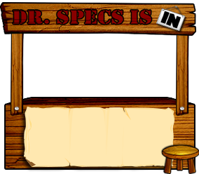
Cute right? It was made for the company website (bottom version) but my dad liked it so much he wanted it for his desk!  It is modeled after Lucy's Help Desk from Peanuts.  I created the base of it (the outlines) in Illustrator, as well as the In sign and nails.  I took some wood textures and used the outlines of the illustrator layers to copy/paste the texture over the base layer, which had the sides darkened, so that when I used blending modes, it created a wood grain texture in dimension!  After everything was said and done, the one made for my dad was such a hit I gave it to him for Christmas.  

The version for work has paper on it to allow for text to be placed.

Languages Online Website Graphics

 So this is for the website for MLS.  I created everything from scratch.  Where to begin?  Well the 6 graphics (portals to the different sections) took several, several remakes and brainstorming of the entire team to come up with, because some of the topics just seemed so lengthy on what they could be. We'll start clockwise. The Expedited Language Course was probably the most revised, changing from a very complicated graphics originally.  It was originally created in Illustrator, then taken to Photoshop to embellish a bit on the colors and glow.  The Topical studies was the easiest, as my first attempt was a winner with the whole team, completely done in Illustrator.  Crypto Language Training took a couple remakes, but I finally ended up burning actual paper to make it look old and using blending options in Photoshop to age it a bit more.  I used odd characters to make lines of unreadable text, then copied in Photoshop the circle behind the Illustrator-made magnifying glass and applied spherize to it.  Refresher Training is actually animated using Photoshop, but was relatively easy once I made a tablet to put it on.  Custom Language Training was simple.  It has the flags from some of the countries representing the languages, and then the languages around the outside circle.  Most of it was made using Photoshop (including the spherize filter to give the flags a bulged look) except the outside ring and title banner on the bottom.  Languages Acquisition & Sustainment Continuum (LASC) was redone a few times.  Finally I created the world, which actually animates and turns, was made in 3DS Max.  I put it in the arrows and used inner shadow to make the depth on the sides of the world under the arrows.  On the left bar is a graphic I made individual graphics to create, Illustrated below.  I reused the world (because it was worth it lol) and the tablet, placing a graphic from one of the games we'd made on it.  I made the mouse look like the one I use (even the blue glow!) and took the books I'd made for one of the games to place on it.  Even though it can't be seen very well, the ink the pen has written was actually written on my tablet and put into perspective with an ink splotch.  I was pretty happy with how all of these turned out.  They were pretty important, and the second big landmark for my new job.  Enjoy!

Web Graphics:
An Adventure in Comprehensive Icons

I did so much research for these!  Making useful graphics for topics can be challenging to keep from becoming too busy.  Anyway, they were created in Illustrator, some things (Like the globe map and some of the parts on the camera) were taken from graphics in my royalty free design library.  They are not terribly remade, because you want them to be recognizable, but I do think they're wonderful!  Even if they are a bit expected.  The image on the photo behind the camera is from another game I'd done earlier where I had to make mountains.  They were all created in Illustrator, then taken to Photoshop to apply the yellow glow around the light bulb, the shadow on the headphones and light bulb (they're blue) and under the camera and globe, as well as the shadows on the info button.  They were sort of the first thing I made to show everyone what I could do at the company other than this first big project I'd been assigned over the course of a couple months.

Flower Embellishment

Created this for one of the games.  I used the colors in the country's flag and was inspired by a design similar that I saw on a building in some photos from the region.  I did most of it in Illustrator using the pen tool of course, and imported it to Photoshop to emphasize the layers with some shadowing.  I was very happy with how it came out, but originally we had it in a grey/black instead of the gold, but I added the gold and it was a hit, so we went with that!  Unfortunately, it was created around Christmas, so the red/green combination was a bit distracting! Oh, there's also an additional stroke applied to the whole thing on the outside in Photoshop.

Materials Spotlight

This was a title used on the website.  It was made mostly in Illustrator then taken to Photoshop to put the shadow on.

News Network Game

This was for another game involving a video.  It was another media theme, so we decided on a wall of tv's like you see in the background during news reports on tv.  It's pretty simple.  Each tv has a screenshot from the video, which was done in Photoshop, with a vector frame of a tv.  The title was done in Illustrator and taken into Photoshop, and the tv screen for the video was made in Illustrator, as was the play button.

Losing Money Animation


 I actually animated this one, but this is a static representation of it.  The money both fills it up (not pictured) and spills out.  Anyway it was fun to do.  I did the initial outlines for every single step in the animation in Illustrator then imported the images into Photoshop on separate layers to shade them.  I then activated the animation feature in Photoshop and animated them with each step. 

Tuesday, January 8, 2013

Million Heir Game


Okay so this is where I get to pretend like I know some fancy foreign language, when really I have no clue and am relying on experts that get paid WAY above my pay grade for knowing such awesome skills!  It says "Million Heir" on the top in red, and "Who will carry the torch?" on the bottom.  Great, right? Anyway yeah so this is for a game that, obviously, is like a "Who Wants to be a Millionaire" spin off.  It was surprisingly easy to find good, clean images of the currency that wasn't under any sort of royalties or anything, but it did take a little time to figure out how to go about formatting all of it.  The title and text boxes are done in Illustrator, then imported into the Photoshop created background and currency document, where another stroke is applied to the boxes (The first being a red stroke in Illustrator).  The buttons were created first in Illustrator, then imported as separate layers (base, outline, text) and edited with a spherize filter and shading.  There are four states, but I believe we only utilized two in the final product.  Check out the buttons and main question page below.  I had fun with this one! 


Fancy Text Boxes

 So I never used these, but I liked them enough to include them in here.  They're text boxes that I'd originally designed for use in the Newspaper layout I'd made for the Before and After Game, but it didn't quite work out.  I loved the swirly bits, though, so I kept them on file for use possibly in the future, although I'm not terribly sure when they'd be useful!  They're made originally in Illustrator, then each part is imported individually into Photoshop to apply the shadows and embossing (which I rarely use but is exceptionally useful for borders) as well as Stroke.

Before and After Newspaper

I had to make a backdrop for a game involving a video sequence to be played (placed in the black area).  The video was like a foreign local news reel, so I had the idea for a newspaper.  The Lorem Ipsum would be where the text for the game would be.  The final product actually changed to be more open, but I like this version so much I thought I'd share it!  I used, as usual, Illustrator, in order to keep everything clean.  Lorem Ipsum is of course filler. There was a little done in Photoshop, just to clean up the aging gradient, although that can be done in Illustrator as well.

Game Avatars

So I had to make some little avatars for a game we're working on at work.  In order to keep it professional, I used Illustrator, which gives me the flexibility of working in a large format then making it smaller without degradation of the image.  The target audience is 20-30 years old.  The idea originally came from a typical image of vector avatar icons, which are normally faceless busts.  It gave me an opportunity to play with hair!  Anyway, yes, they're static avatars.  I'm very pleased with how they turned out.


Wednesday, May 2, 2012

Jurassic Park Poster - in TEXT ONLY

I did this for an assignment, but I was so proud of how it turned out that I had to share it on here.  It's completely done in text.  I used only Illustrator to make it, recreating the Jurassic Park poster.  I adored the movie when it came out, being a paleo-fanatic.  It took a while, but I achieved it!  Lots of the pen tool, clipping masks, and text tool.

Welcome to My Wall

I wanted a different header for my Facebook page, now that they're doing the different appearance on the timeline appearance, so I was playing with the texture library I've started, and I came up with this.  I don't often play with textures from cgtextures.com, but I decided to give it a shot.  I like how it turned out!  All done in photoshop.

Chevelle

I took a cell phone picture of a classic Chevelle a while back, saying it's the care I'd get one day.  Well I love the shape it has so much that I outlined it in Illustrator and then outlined some accents it had, like glares and shadows, then put them on top of the car.  The shadow is another layer of outlines as well.  It took a while, but eventually it turned into this! All in Illustrator.